CSS Units
Length
Length can be expressed several ways. Because we want to make adaptable, responsive designs, it's typical we want to use relative units which adapt to pixel density, the device size and orientation and the user's zoom preference.
I'll only describe a few here: px, em, rem, and viewport-relative.
Pixels
px is a way of setting an absolute size using a unit of measurement that is derived from pixels. Pixels is a natural fit for content which itself has a natural pixel unit, for example an image or video. For most other sizing tasks, it's preferred though to use a relative unit based on the text size or viewport size.
Pixel units can be necessary to work with because some DOM APIs only return sizes in pixels. Remember though that the pixel unit doesn't have a cross-device correspondence to physical size. That is to say, a square of 100 pixels x 100 pixels won't necessarily be the same physical size on a two different kinds of devices.
Here, we use pixel units to specify the width and height of an element with id 'rectangle':
#rectangle {
  width: 100px;
  height: 200px;
}
Font-relative units
em and rem are a unit based on the size of the typeface used. em relates to the typeface size of the element being styled, while rem relates to the root document's typeface size. 'rem' is the preferred unit for sizing text because it is easier to understand and typically how you want text sizing to work.
Here for example, we set the size of H1 headings to be twice the font size of its parent, while H2 headings set to 1.5x the document font size:
h1 {
  font-size: 2em;
}
h2 {
  font-size: 1.5rem;
}
Viewport-relative units
The viewport is the screen area that a web page is shown in. For mobile devices, the viewport is static (and dependent on the size of the device's screen), while for desktop devices, the viewport size depends on the size of the browser window, and changes if the user resizes the browser.
You can relate to the viewport's height (vw), width (vw), the smallest dimension (vmin) or the largest dimension (vmax).
The unit works like a percentage: 1vw equates to 1% of the viewport width, for example.
nav {
  width: 100vw;
}
aside {
  width: 10vw;
}
vmin and vmax will refer to the height or width of the viewport, whichever is smaller (vmin) or bigger (vmax).
It is also common to use percentage to specify dimensions. In this case the percentage relates to the parent (or containing) element.
nav {
  width: 100%;
}
aside {
  width: 10%;
}
Read more
- The Lengths of CSS (CSS Tricks)
- Viewport units in CSS
Colour
Colour can be expressed several ways. For quick experimentation, its useful to use named colours, but only predefined colours are available.
body {
  background-color: silver;
}
Hexcodes are a 'classic' way of representing colour. You can find out the hexcode of a colour by using a colour picker in most programs. The hash (#) symbol is required.
body {
  background-color: #b467c2;
}
Hexcodes use the hexadecimal technique for formatting numbers. In the previous example, the hexadecimal b467c2 equates to a red value of b4, a green value of 67 and a blue value of c2. Converted to decimals, this gives us red: 180, green: 103 and blue: 194. Each value has a maximum of 255, so white is represented as #ffffff (255, 255, 255) and black is #000 (0, 0, 0).
A more readable form is the rgb function:
body {
  background-color: rgb(190, 103, 194);
}
But even then, it's pretty hard to see purple in 190, 103, 194. Furthermore, complex math is required if you want to transform that colour, for example to blend colours.
Manipulating colour as hue, saturation and lightness (HSL) is a bit better. Here's an example of setting a hue of 290 degrees, saturation of 43% and lightness of 83%:
body {
  color: hsl(180, 43%, 83%);
}
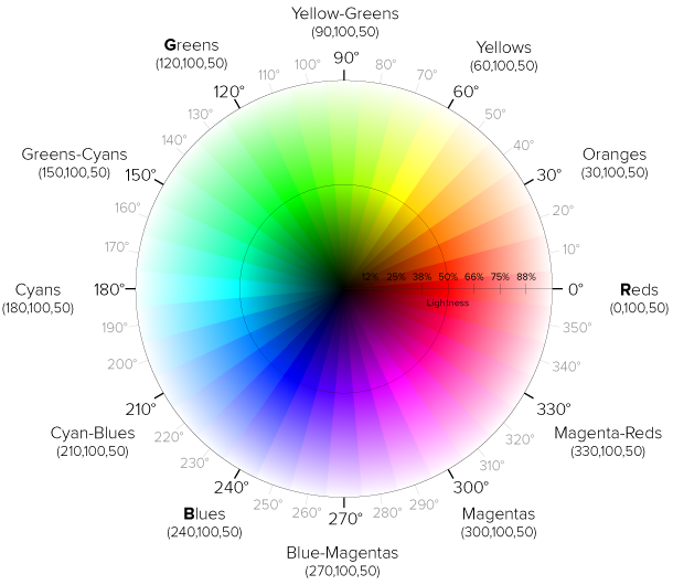
Hue refers to the colour's position on a colour wheel, and is specified as an angle. Red is 0, green is 120 and blue is 240. The handy thing about hue is that if you go over the maximum angle, the colour wraps around the colour wheel. So a hue of 360 is the same as 0 (red), and a value of 480 is the same as 120 (green). Likewise you can also "turn" in the opposite direction indefinitely. A hue of -120 is the same as 120.

(Diagram by Erin Sowards)
Saturation is expressed as a percentage. 100% is complete saturation and 0% is grey.
Lightness is also expressed as a percentage. 50% lightness is the normal value, with lower values bringing the colour closer to black, and higher values closer to white.
You can play with an interactive hue wheel here.
Opacity
If you want to adjust opacity, use the rgba() and hsla() versions. The 'a' stands for 'alpha channel'. This is a bit of a throwback to other computer graphics concepts, but for now it suffices to say that the 'alpha' value can be read as meaning the same as the opacity of the colour. It is a percentage, with 0% being transparent, 50% being half-transparent and 100% being fully opaque.
body {
  background-color: rgba(180, 103, 194, 50%);
  color: hsla(290, 43%, 83%, 80%);
}
Read more
- Colorme - Tool for experimenting with colour declarations and using colour functions
- Colour units (Codrops)
- Colour values (MDN)
- rgba() Codrops
- hsla() Codrops